In [21]:
plt.figure(figsize=(12, 12))
sns.barplot(x=df.Date.unique(), y=df.Date.value_counts(
sort=False), palette='viridis')
plt.title("Invoices per Month")
plt.show()

This is a transnational data set which contains all the transactions occurring between 01/12/2010 and 09/12/2011 for a UK-based and registered non-store online retail.The company mainly sells unique all-occasion gifts. Many customers of the company are wholesalers.
InvoiceNo: Invoice number. Nominal, a 6-digit integral number uniquely assigned to each transaction. If this code starts with letter 'c', it indicates a cancellation.
StockCode: Product (item) code. Nominal, a 5-digit integral number uniquely assigned to each distinct product.
Description: Product (item) name. Nominal.
Quantity: The quantities of each product (item) per transaction. Numeric.
InvoiceDate: Invoice Date and time. Numeric, the day and time when each transaction was generated.
UnitPrice: Unit price. Numeric, Product price per unit in sterling.
CustomerID: Customer number. Nominal, a 5-digit integral number uniquely assigned to each customer.
Country: Country name. Nominal, the name of the country where each customer resides.
It is a business critical requirement to understand the value derived from a customer. RFM is a method used for analyzing customer value.
Perform customer segmentation using RFM analysis. The resulting segments can be ordered from most valuable (highest recency, frequency, and value) to least valuable (lowest recency, frequency, and value). Identifying the most valuable RFM segments can capitalize on chance relationships in the data used for this analysis.
Import python libraries from PyData stack.
# for Extracting, Transforming, Loading Data--as well as--Processing, Analyzing, and Visualizing Data
import pandas as pd
import numpy as np
import matplotlib.pyplot as plt
import seaborn as sns
import datetime as dt

# for Statistical Analysis
from scipy import stats

# for Machine Learning
from sklearn.preprocessing import StandardScaler
from sklearn.manifold import TSNE
from sklearn.cluster import KMeans

import feature_engine
from feature_engine.outliers import Winsorizer


# for Sane and Clear Outputs
import warnings
warnings.filterwarnings("ignore")
The following cell is commented out as it only needs to be run once to create csv versions of the given data. Processing in pandas using the excel format takes up unneccesary memory and slows down processing (I think?).
# excel = pd.read_excel('Online Retail.xlsx')
# excel.to_csv('retail.csv')

# excel = pd.read_excel('train.xlsx')
# excel.to_csv('train.csv')

# excel = pd.read_excel('test.xlsx')
# excel.to_csv('test.csv')
The 'ISO' encoding serves the same aforementioned space saving purpose. The default would be 'UTF-8' which is multi-byte designations for individual characters in the csv; ISO reduces them to single-byte characters.
df = pd.read_csv('retail.csv', encoding='ISO-8859-1',
                 index_col=0, parse_dates=['InvoiceDate'])
df.head()
| InvoiceNo | StockCode | Description | Quantity | InvoiceDate | UnitPrice | CustomerID | Country | |
|---|---|---|---|---|---|---|---|---|
| 0 | 536365 | 85123A | WHITE HANGING HEART T-LIGHT HOLDER | 6 | 2010-12-01 08:26:00 | 2.55 | 17850.0 | United Kingdom |
| 1 | 536365 | 71053 | WHITE METAL LANTERN | 6 | 2010-12-01 08:26:00 | 3.39 | 17850.0 | United Kingdom |
| 2 | 536365 | 84406B | CREAM CUPID HEARTS COAT HANGER | 8 | 2010-12-01 08:26:00 | 2.75 | 17850.0 | United Kingdom |
| 3 | 536365 | 84029G | KNITTED UNION FLAG HOT WATER BOTTLE | 6 | 2010-12-01 08:26:00 | 3.39 | 17850.0 | United Kingdom |
| 4 | 536365 | 84029E | RED WOOLLY HOTTIE WHITE HEART. | 6 | 2010-12-01 08:26:00 | 3.39 | 17850.0 | United Kingdom |
df.tail()
| InvoiceNo | StockCode | Description | Quantity | InvoiceDate | UnitPrice | CustomerID | Country | |
|---|---|---|---|---|---|---|---|---|
| 541904 | 581587 | 22613 | PACK OF 20 SPACEBOY NAPKINS | 12 | 2011-12-09 12:50:00 | 0.85 | 12680.0 | France |
| 541905 | 581587 | 22899 | CHILDREN'S APRON DOLLY GIRL | 6 | 2011-12-09 12:50:00 | 2.10 | 12680.0 | France |
| 541906 | 581587 | 23254 | CHILDRENS CUTLERY DOLLY GIRL | 4 | 2011-12-09 12:50:00 | 4.15 | 12680.0 | France |
| 541907 | 581587 | 23255 | CHILDRENS CUTLERY CIRCUS PARADE | 4 | 2011-12-09 12:50:00 | 4.15 | 12680.0 | France |
| 541908 | 581587 | 22138 | BAKING SET 9 PIECE RETROSPOT | 3 | 2011-12-09 12:50:00 | 4.95 | 12680.0 | France |
Perform a preliminary data inspection and Data cleaning
a. Check for missing data and formulate apt strategy to treat them.
b. Are there any duplicate data records? Remove them if present.
c. Perform Descriptive analytics on the given data.
The following function is just a personal preference I've used on past projects/assignments as I find it to be more robust than `df.info()`. That being said, the `min` and `max` columns were a recent addition due to initially ignoring negative values from this dataset.
def summary(df):
    obs = df.shape[0]
    types = df.dtypes
    counts = df.apply(lambda x: x.count())
    uniques = df.apply(lambda x: x.unique().shape[0])
    nulls = df.apply(lambda x: x.isnull().sum())
    min = df.min()
    max = df.max()
    print('Data shape:', df.shape)

    cols = ['types', 'counts', 'uniques', 'nulls', 'min', 'max']
    summary = pd.concat([types, counts, uniques, nulls,
                        min, max], axis=1, sort=True)

    summary.columns = cols
    dtypes = summary.types.value_counts()
    print('___________________________\nData types:')
    print(summary.types.value_counts())
    print('___________________________')
    return summary
details = summary(df)
display(details.sort_values(by='nulls', ascending=False))
Data shape: (541909, 8)
___________________________
Data types:
object            4
float64           2
datetime64[ns]    1
int64             1
Name: types, dtype: int64
___________________________
| types | counts | uniques | nulls | min | max | |
|---|---|---|---|---|---|---|
| CustomerID | float64 | 406829 | 4373 | 135080 | 12346.0 | 18287.0 |
| Description | object | 540455 | 4224 | 1454 | NaN | NaN |
| Country | object | 541909 | 38 | 0 | Australia | Unspecified |
| InvoiceDate | datetime64[ns] | 541909 | 23260 | 0 | 2010-12-01 08:26:00 | 2011-12-09 12:50:00 |
| InvoiceNo | object | 541909 | 25900 | 0 | 536365 | C581569 |
| Quantity | int64 | 541909 | 722 | 0 | -80995 | 80995 |
| StockCode | object | 541909 | 4070 | 0 | 10002 | m |
| UnitPrice | float64 | 541909 | 1630 | 0 | -11062.06 | 38970.0 |
df.describe()
| Quantity | UnitPrice | CustomerID | |
|---|---|---|---|
| count | 541909.000000 | 541909.000000 | 406829.000000 |
| mean | 9.552250 | 4.611114 | 15287.690570 |
| std | 218.081158 | 96.759853 | 1713.600303 |
| min | -80995.000000 | -11062.060000 | 12346.000000 |
| 25% | 1.000000 | 1.250000 | 13953.000000 |
| 50% | 3.000000 | 2.080000 | 15152.000000 |
| 75% | 10.000000 | 4.130000 | 16791.000000 |
| max | 80995.000000 | 38970.000000 | 18287.000000 |
Almost 25% of our data lacks a **CustomerID** and must be dropped as it cannot be included in our RFM model.
df.isnull().mean()
InvoiceNo      0.000000
StockCode      0.000000
Description    0.002683
Quantity       0.000000
InvoiceDate    0.000000
UnitPrice      0.000000
CustomerID     0.249267
Country        0.000000
dtype: float64
But as we'll see later, those undocumented customers come from our primary data source--the UK--and could reflect cash payments. So no one needs to be fired... yet.
df[df.isnull().any(axis=1)].Country.value_counts(normalize=True)
United Kingdom    0.989044
EIRE              0.005264
Hong Kong         0.002132
Unspecified       0.001495
Switzerland       0.000925
France            0.000489
Israel            0.000348
Portugal          0.000289
Bahrain           0.000015
Name: Country, dtype: float64
Almost 1% of our data consists of duplicate or redundant records.
df.duplicated().mean()
0.009721189350979592
df.loc[(df.UnitPrice < 0)]
| InvoiceNo | StockCode | Description | Quantity | InvoiceDate | UnitPrice | CustomerID | Country | |
|---|---|---|---|---|---|---|---|---|
| 299983 | A563186 | B | Adjust bad debt | 1 | 2011-08-12 14:51:00 | -11062.06 | NaN | United Kingdom |
| 299984 | A563187 | B | Adjust bad debt | 1 | 2011-08-12 14:52:00 | -11062.06 | NaN | United Kingdom |
df.loc[(df.Quantity < 0)]
| InvoiceNo | StockCode | Description | Quantity | InvoiceDate | UnitPrice | CustomerID | Country | |
|---|---|---|---|---|---|---|---|---|
| 141 | C536379 | D | Discount | -1 | 2010-12-01 09:41:00 | 27.50 | 14527.0 | United Kingdom |
| 154 | C536383 | 35004C | SET OF 3 COLOURED FLYING DUCKS | -1 | 2010-12-01 09:49:00 | 4.65 | 15311.0 | United Kingdom |
| 235 | C536391 | 22556 | PLASTERS IN TIN CIRCUS PARADE | -12 | 2010-12-01 10:24:00 | 1.65 | 17548.0 | United Kingdom |
| 236 | C536391 | 21984 | PACK OF 12 PINK PAISLEY TISSUES | -24 | 2010-12-01 10:24:00 | 0.29 | 17548.0 | United Kingdom |
| 237 | C536391 | 21983 | PACK OF 12 BLUE PAISLEY TISSUES | -24 | 2010-12-01 10:24:00 | 0.29 | 17548.0 | United Kingdom |
| ... | ... | ... | ... | ... | ... | ... | ... | ... |
| 540449 | C581490 | 23144 | ZINC T-LIGHT HOLDER STARS SMALL | -11 | 2011-12-09 09:57:00 | 0.83 | 14397.0 | United Kingdom |
| 541541 | C581499 | M | Manual | -1 | 2011-12-09 10:28:00 | 224.69 | 15498.0 | United Kingdom |
| 541715 | C581568 | 21258 | VICTORIAN SEWING BOX LARGE | -5 | 2011-12-09 11:57:00 | 10.95 | 15311.0 | United Kingdom |
| 541716 | C581569 | 84978 | HANGING HEART JAR T-LIGHT HOLDER | -1 | 2011-12-09 11:58:00 | 1.25 | 17315.0 | United Kingdom |
| 541717 | C581569 | 20979 | 36 PENCILS TUBE RED RETROSPOT | -5 | 2011-12-09 11:58:00 | 1.25 | 17315.0 | United Kingdom |
10624 rows × 8 columns
91% of our transactions are from the UK so we may want to consider isolating it and analyzing it separately.
df.Country.value_counts(normalize=True)
United Kingdom          0.914320
Germany                 0.017521
France                  0.015790
EIRE                    0.015124
Spain                   0.004674
Netherlands             0.004375
Belgium                 0.003818
Switzerland             0.003694
Portugal                0.002803
Australia               0.002323
Norway                  0.002004
Italy                   0.001482
Channel Islands         0.001399
Finland                 0.001283
Cyprus                  0.001148
Sweden                  0.000853
Unspecified             0.000823
Austria                 0.000740
Denmark                 0.000718
Japan                   0.000661
Poland                  0.000629
Israel                  0.000548
USA                     0.000537
Hong Kong               0.000531
Singapore               0.000423
Iceland                 0.000336
Canada                  0.000279
Greece                  0.000269
Malta                   0.000234
United Arab Emirates    0.000125
European Community      0.000113
RSA                     0.000107
Lebanon                 0.000083
Lithuania               0.000065
Brazil                  0.000059
Czech Republic          0.000055
Bahrain                 0.000035
Saudi Arabia            0.000018
Name: Country, dtype: float64
Drop duplicates
df = df.drop_duplicates()
Ignore Irrelevant Data
df = df[df.Quantity > 0]
df = df[df.UnitPrice > 0]
Drop null **CustomerID**'s / Keep null **Description**'s
df = df[pd.notnull(df['CustomerID'])]
df['CustomerID'] = df['CustomerID'].astype('int')
Add simplified **Date** column to groupby
df['InvoiceDate'] = pd.to_datetime(df['InvoiceDate'])
df['Date'] = df['InvoiceDate'].dt.strftime('%Y-%m-%d')
df['Date'] = pd.to_datetime(df['Date'])
df['Date'] = df['Date'].dt.strftime('%Y-%m')
*Sanity Check*
df.duplicated().mean()
0.0
df.isnull().mean()
InvoiceNo      0.0
StockCode      0.0
Description    0.0
Quantity       0.0
InvoiceDate    0.0
UnitPrice      0.0
CustomerID     0.0
Country        0.0
Date           0.0
dtype: float64
Add **Revenue** column
df['Revenue'] = df['Quantity']*df['UnitPrice']
df.to_csv('eda.csv')
plt.figure(figsize=(12, 12))
sns.barplot(x=df.Date.unique(), y=df.Date.value_counts(
    sort=False), palette='viridis')
plt.title("Invoices per Month")
plt.show()
top_products = df['Description'].value_counts()[:25]
plt.figure(figsize=(12, 12))
sns.barplot(y=top_products.index,
            x=top_products.values,
            palette='viridis_r')
plt.title("Top selling products")
plt.show()

Cohort Analysis: A cohort is a group of subjects who share a defining characteristic. We can observe how a cohort behaves across time and compare it to other cohorts.
a. Create month cohorts and analyse active customers for each cohort.
b. Also Analyse the retention rate of customers. Comment.
For cohort analysis, there are a few labels that we have to create:
# Create a copy of dataframe for cohort analysis
cohort = df.copy()
Defining a cohort is the first step to cohort analysis. We will now create monthly cohorts based on the month each customer has made their first transaction.
# Define a function that will parse the date
def get_month(x):
    return dt.datetime(x.year, x.month, 1)


# Create InvoiceMonth column
cohort['InvoiceMonth'] = cohort['InvoiceDate'].apply(get_month)

# Group by CustomerID and select the InvoiceMonth value
grouping = cohort.groupby('CustomerID')['InvoiceMonth']

# Assign a minimum InvoiceMonth value to the dataset
cohort['CohortMonth'] = grouping.transform('min')
Calculating time offset for each transaction allows you to report the metrics for each cohort in a comparable fashion.
First, we will create some variables that capture the integer value of years and months for Invoice and Cohort Date using the get_date_int() function
def get_date_int(df, column):
    year = df[column].dt.year
    month = df[column].dt.month
    return year, month


# Get the integers for date parts from the `InvoiceMonth` column
invoice_year, invoice_month = get_date_int(cohort, 'InvoiceMonth')

# Get the integers for date parts from the `CohortMonth` column
cohort_year, cohort_month = get_date_int(cohort, 'CohortMonth')

# Calculate difference in years
years_diff = invoice_year - cohort_year

# Calculate difference in months
months_diff = invoice_month - cohort_month

# Extract the difference in months from all previous values
cohort['CohortIndex'] = years_diff * 12 + months_diff + 1

cohort.head()
| InvoiceNo | StockCode | Description | Quantity | InvoiceDate | UnitPrice | CustomerID | Country | Date | Revenue | InvoiceMonth | CohortMonth | CohortIndex | |
|---|---|---|---|---|---|---|---|---|---|---|---|---|---|
| 0 | 536365 | 85123A | WHITE HANGING HEART T-LIGHT HOLDER | 6 | 2010-12-01 08:26:00 | 2.55 | 17850 | United Kingdom | 2010-12 | 15.30 | 2010-12-01 | 2010-12-01 | 1 |
| 1 | 536365 | 71053 | WHITE METAL LANTERN | 6 | 2010-12-01 08:26:00 | 3.39 | 17850 | United Kingdom | 2010-12 | 20.34 | 2010-12-01 | 2010-12-01 | 1 |
| 2 | 536365 | 84406B | CREAM CUPID HEARTS COAT HANGER | 8 | 2010-12-01 08:26:00 | 2.75 | 17850 | United Kingdom | 2010-12 | 22.00 | 2010-12-01 | 2010-12-01 | 1 |
| 3 | 536365 | 84029G | KNITTED UNION FLAG HOT WATER BOTTLE | 6 | 2010-12-01 08:26:00 | 3.39 | 17850 | United Kingdom | 2010-12 | 20.34 | 2010-12-01 | 2010-12-01 | 1 |
| 4 | 536365 | 84029E | RED WOOLLY HOTTIE WHITE HEART. | 6 | 2010-12-01 08:26:00 | 3.39 | 17850 | United Kingdom | 2010-12 | 20.34 | 2010-12-01 | 2010-12-01 | 1 |
Customer retention is a very useful metric to understand how many of all the customers are still active. It gives you the percentage of active customers compared to the total number of customers
grouping = cohort.groupby(['CohortMonth', 'CohortIndex'])

# Count the number of unique values per customer ID
cohort_data = grouping['CustomerID'].apply(pd.Series.nunique).reset_index()

# Create a pivot
cohort_counts = cohort_data.pivot(
    index='CohortMonth', columns='CohortIndex', values='CustomerID')

# Select the first column and store it to cohort_sizes
cohort_sizes = cohort_counts.iloc[:, 0]

# Divide the cohort count by cohort sizes along the rows
retention = cohort_counts.divide(cohort_sizes, axis=0)*100

month_list = ["Dec '10", "Jan '11", "Feb '11", "Mar '11", "Apr '11",
              "May '11", "Jun '11", "Jul '11", "Aug '11", "Sep '11",
              "Oct '11", "Nov '11", "Dec '11"]

plt.figure(figsize=(12, 12))
sns.heatmap(data=retention,
            annot=True,
            vmin=0.0,
            cmap='viridis',
            vmax=list(retention.max().sort_values(ascending=False))[1]+3,
            fmt='.1f',
            linewidth=0.3,
            yticklabels=month_list)
plt.show()

Now we will calculate the average price metric and analyze if there are any differences in shopping patterns across time and across cohorts.
# Create a groupby object and pass the monthly cohort and cohort index as a list
grouping = cohort.groupby(['CohortMonth', 'CohortIndex'])

# Calculate the average of the unit price column
cohort_data = grouping['UnitPrice'].mean()

# Reset the index of cohort_data
cohort_data = cohort_data.reset_index()

# Create a pivot
average_price = cohort_data.pivot(
    index='CohortMonth', columns='CohortIndex', values='UnitPrice')
average_price.round(1)
average_price.index = average_price.index.date

plt.figure(figsize=(12, 12))
sns.heatmap(data=average_price,
            annot=True,
            vmin=0.0,
            cmap='viridis',
            vmax=list(average_price.max().sort_values(ascending=False))[1]+3,
            fmt='.1f',
            linewidth=0.3,
            yticklabels=month_list)
plt.show()

Now we will calculate the average quantity metric and analyze if there are any differences in shopping patterns across time and across cohorts.
# Create a groupby object and pass the monthly cohort and cohort index as a list
grouping = cohort.groupby(['CohortMonth', 'CohortIndex'])

# Calculate the average of the Quantity column
cohort_data = grouping['Quantity'].mean()

# Reset the index of cohort_data
cohort_data = cohort_data.reset_index()

# Create a pivot
average_quantity = cohort_data.pivot(
    index='CohortMonth', columns='CohortIndex', values='Quantity')

plt.figure(figsize=(12, 12))
sns.heatmap(data=average_quantity,
            annot=True,
            vmin=0.0,
            cmap='viridis',
            vmax=list(average_quantity.max().sort_values(
                ascending=False))[1]+3,
            fmt='.1f',
            linewidth=0.3,
            yticklabels=month_list)
plt.show()

dummies = pd.get_dummies(df['Date'])
df = df.join(dummies)
all_months = df.groupby('Date').agg({'CustomerID': 'nunique', 'Quantity': 'sum', 'Revenue': 'sum', '2010-12': 'sum',
                                     '2011-01': 'sum', '2011-02': 'sum', '2011-03': 'sum', '2011-04': 'sum', '2011-05': 'sum', '2011-06': 'sum',
                                     '2011-07': 'sum', '2011-08': 'sum', '2011-09': 'sum', '2011-10': 'sum', '2011-11': 'sum', '2011-12': 'sum'})

all_customers = df.groupby('CustomerID').agg({'Date': ['min', 'max', 'nunique'], 'Quantity': 'sum', 'Revenue': 'sum', '2010-12': 'sum',
                                              '2011-01': 'sum', '2011-02': 'sum', '2011-03': 'sum', '2011-04': 'sum', '2011-05': 'sum', '2011-06': 'sum',
                                              '2011-07': 'sum', '2011-08': 'sum', '2011-09': 'sum', '2011-10': 'sum', '2011-11': 'sum', '2011-12': 'sum'})
Build a RFM model – Recency Frequency and Monetary based on their behaviour.
Recency is about when was the last order of a customer. It means the number of days since a customer made the last purchase. If it’s a case for a website or an app, this could be interpreted as the last visit day or the last login time.
Frequency is about the number of purchase in a given period. It could be 3 months, 6 months or 1 year. So we can understand this value as for how often or how many a customer used the product of a company. The bigger the value is, the more engaged the customers are. Could we say them as our VIP? Not necessary. Cause we also have to think about how much they actually paid for each purchase, which means monetary value.
Monetary is the total amount of money a customer spent in that given period. Therefore big spenders will be differentiated with other customers such as MVP or VIP.
a. Calculate RFM metrics.
 i. Recency as the time in no. of days since last transaction
 ii. Frequency as count of purchases done
 iii. Monetary value as total amount spend
b. Build RFM Segments.
 i. Give Recency Frequency and Monetary scores individually by
 dividing them in to quartiles.

 Note: Rate "Recency" for customer who have been active more recently
 better than the less recent customer, because each company wants its
 customers to be recent

 Rate "Frequency" and "Monetary Value" higher label because we want
 Customer to spend more money and visit more often.

 ii. Combine three ratings to get a RFM segment (as strings)
 iii. Get the RFM score by adding up the three ratings.
c. Analyse the RFM Segments by summarizing them and comment on the findings.
To perform RFM analysis, we divide customers into four equal groups according to the distribution of values for recency, frequency, and monetary value. Four equal groups across three variables create 64 (4x4x4) different customer segments, which is a manageable number.
This customer belongs to RFM segment 4-4-4 (Best Customers), (R=4, F=4, M=4)
Below is a table with key RFM segments:
| Segment | RFM | Description | Marketing |
|---|---|---|---|
| Best Customers | 444 | Customers who bought most recently, most often, and spent the most. | New products and Loyalty programs |
| Loyal Customers | 344 | Customers who bought most recently. | Use R and M to further segment |
| Big Spenders | 334 | Customers who spent the most. | Market most expensive products |
| Almost Lost | 244 | Haven't purchased recently, but did make frequent purchases at high cost. | Aggressive price incentives |
| Lost Customers | 144 | Haven't purchased in some time, but used to make frequent purchases at high cost. | Aggressive price incentives |
| Lost Cheap Customers | 122 | Haven't purchased in some time; did not purchase often or spend very much. | Don't spend too much to reacquire |
Recency is about when was the last order of a customer. It means the number of days since a customer made the last purchase. If it’s a case for a website or an app, this could be interpreted as the last visit day or the last login time.
df['InvoiceDate'].max()
Timestamp('2011-12-09 12:50:00')
# Lets set this date as the today's date for further analysis
current_date = dt.date(2011, 12, 9)

# Lets create a date column for date values only
df['Purchase_Date'] = df.InvoiceDate.dt.date

recency = df.groupby('CustomerID')['Purchase_Date'].max().reset_index()

# Create a separate column for this date.
recency = recency.assign(Current_Date=current_date)

# Compute the number of days since last purchase
recency['Recency'] = recency.Purchase_Date.apply(
    lambda x: (current_date - x).days)

recency.head()
| CustomerID | Purchase_Date | Current_Date | Recency | |
|---|---|---|---|---|
| 0 | 12346 | 2011-01-18 | 2011-12-09 | 325 |
| 1 | 12347 | 2011-12-07 | 2011-12-09 | 2 |
| 2 | 12348 | 2011-09-25 | 2011-12-09 | 75 |
| 3 | 12349 | 2011-11-21 | 2011-12-09 | 18 |
| 4 | 12350 | 2011-02-02 | 2011-12-09 | 310 |
# Drop the irrelevant Date columns
recency.drop(['Purchase_Date', 'Current_Date'], axis=1, inplace=True)
Frequency is about the number of purchase in a given period. It could be 3 months, 6 months or 1 year. So we can understand this value as for how often or how many a customer used the product of a company. The bigger the value is, the more engaged the customers are. Could we say them as our VIP? Not necessary. Cause we also have to think about how much they actually paid for each purchase, which means monetary value
frequency = df.groupby('CustomerID').InvoiceNo.nunique(
).reset_index().rename(columns={'InvoiceNo': 'Frequency'})

frequency.head()
| CustomerID | Frequency | |
|---|---|---|
| 0 | 12346 | 1 |
| 1 | 12347 | 7 |
| 2 | 12348 | 4 |
| 3 | 12349 | 1 |
| 4 | 12350 | 1 |
Monetary is the total amount of money a customer spent in that given period. Therefore big spenders will be differentiated with other customers such as MVP or VIP.
# Create a separate column for Total Cost of Unit purchased
df['Total_cost'] = df.Quantity * df.UnitPrice

monetary = df.groupby('CustomerID').Total_cost.sum(
).reset_index().rename(columns={'Total_cost': 'Monetary'})

monetary.head()
| CustomerID | Monetary | |
|---|---|---|
| 0 | 12346 | 77183.60 |
| 1 | 12347 | 4310.00 |
| 2 | 12348 | 1797.24 |
| 3 | 12349 | 1757.55 |
| 4 | 12350 | 334.40 |
Now Combine all three to form an aggregated RFM Table
temp = recency.merge(frequency, on='CustomerID')
rfm_table = temp.merge(monetary, on='CustomerID')
rfm_table.head()
| CustomerID | Recency | Frequency | Monetary | |
|---|---|---|---|---|
| 0 | 12346 | 325 | 1 | 77183.60 |
| 1 | 12347 | 2 | 7 | 4310.00 |
| 2 | 12348 | 75 | 4 | 1797.24 |
| 3 | 12349 | 18 | 1 | 1757.55 |
| 4 | 12350 | 310 | 1 | 334.40 |
The simplest way to create customers segments from RFM Model is to use Quantiles. We assign a score from 1 to 4 to Recency, Frequency and Monetary. Four is the best/highest value, and one is the lowest/worst value. A final RFM score is calculated simply by combining individual RFM score numbers.
# RFM Quantiles
quantiles = rfm_table.quantile(q=[0.25, 0.5, 0.75])

# Let's convert quartile information into a dictionary so that cutoffs can be picked up.
quantiles = quantiles.to_dict()

quantiles
{'CustomerID': {0.25: 13813.25, 0.5: 15299.5, 0.75: 16778.75},
 'Recency': {0.25: 17.0, 0.5: 50.0, 0.75: 141.75},
 'Frequency': {0.25: 1.0, 0.5: 2.0, 0.75: 5.0},
 'Monetary': {0.25: 306.48249999999996, 0.5: 668.57, 0.75: 1660.5974999999999}}
We will create two segmentation classes since, high recency is bad, while high frequency and monetary value is good
# Arguments (x = value, p = recency, monetary_value, frequency, d = quantiles dict)
def RScore(x, p, d):
    if x <= d[p][0.25]:
        return 4
    elif x <= d[p][0.50]:
        return 3
    elif x <= d[p][0.75]:
        return 2
    else:
        return 1
# Arguments (x = value, p = recency, monetary_value, frequency, k = quantiles dict)
def FMScore(x, p, d):
    if x <= d[p][0.25]:
        return 1
    elif x <= d[p][0.50]:
        return 2
    elif x <= d[p][0.75]:
        return 3
    else:
        return 4
rfm_segment = rfm_table.copy()
rfm_segment['R_Quartile'] = rfm_segment['Recency'].apply(
    RScore, args=('Recency', quantiles,))
rfm_segment['F_Quartile'] = rfm_segment['Frequency'].apply(
    FMScore, args=('Frequency', quantiles,))
rfm_segment['M_Quartile'] = rfm_segment['Monetary'].apply(
    FMScore, args=('Monetary', quantiles,))
rfm_segment.head()
| CustomerID | Recency | Frequency | Monetary | R_Quartile | F_Quartile | M_Quartile | |
|---|---|---|---|---|---|---|---|
| 0 | 12346 | 325 | 1 | 77183.60 | 1 | 1 | 4 |
| 1 | 12347 | 2 | 7 | 4310.00 | 4 | 4 | 4 |
| 2 | 12348 | 75 | 4 | 1797.24 | 2 | 3 | 4 |
| 3 | 12349 | 18 | 1 | 1757.55 | 3 | 1 | 4 |
| 4 | 12350 | 310 | 1 | 334.40 | 1 | 1 | 2 |
rfm_segment['RFM'] = rfm_segment.R_Quartile.map(
    str) + rfm_segment.F_Quartile.map(str) + rfm_segment.M_Quartile.map(str)
rfm_segment['Score'] = rfm_segment[[
    'R_Quartile', 'F_Quartile', 'M_Quartile']].sum(axis=1)
rfm_segment.head()
| CustomerID | Recency | Frequency | Monetary | R_Quartile | F_Quartile | M_Quartile | RFM | Score | |
|---|---|---|---|---|---|---|---|---|---|
| 0 | 12346 | 325 | 1 | 77183.60 | 1 | 1 | 4 | 114 | 6 |
| 1 | 12347 | 2 | 7 | 4310.00 | 4 | 4 | 4 | 444 | 12 |
| 2 | 12348 | 75 | 4 | 1797.24 | 2 | 3 | 4 | 234 | 9 |
| 3 | 12349 | 18 | 1 | 1757.55 | 3 | 1 | 4 | 314 | 8 |
| 4 | 12350 | 310 | 1 | 334.40 | 1 | 1 | 2 | 112 | 4 |
Lets define the customers segment best to our knowledge basis RFM score and assign them to each customer respectively.
# Create a dictionary for each segment to map them against each customer
segment_dict = {
    # Highest frequency as well as monetary value with least recency
    'Best Customers': '444',
    # High frequency as well as monetary value with good recency
    'Loyal Customers': '344',
    # High monetary value but good recency and frequency values
    'Big Spenders': '334',
    # Customer's shopping less often now who used to shop a lot
    'Almost Lost': '244',
    # Customer's shopped long ago who used to shop a lot.
    'Lost Customers': '144',
    # Customer's who recently started shopping a lot but with less monetary value
    'Recent Customers': '443',
    # Customer's shopped long ago but with less frequency and monetary value
    'Lost Cheap Customers': '122'
}

# Swap the key and value of dictionary
dict_segment = dict(zip(segment_dict.values(), segment_dict.keys()))

# Allocate segments to each customer as per the RFM score mapping
rfm_segment['Segment'] = rfm_segment.RFM.map(lambda x: dict_segment.get(x))

# Allocate all remaining customers to others segment category
rfm_segment.Segment.fillna('others', inplace=True)

rfm_segment.sample(10)
| CustomerID | Recency | Frequency | Monetary | R_Quartile | F_Quartile | M_Quartile | RFM | Score | Segment | |
|---|---|---|---|---|---|---|---|---|---|---|
| 2643 | 15948 | 8 | 2 | 955.24 | 4 | 2 | 3 | 423 | 9 | others |
| 3856 | 17628 | 81 | 1 | 75.75 | 2 | 1 | 1 | 211 | 4 | others |
| 3572 | 17232 | 2 | 2 | 417.77 | 4 | 2 | 2 | 422 | 8 | others |
| 1083 | 13812 | 42 | 3 | 539.00 | 3 | 3 | 2 | 332 | 8 | others |
| 3867 | 17643 | 373 | 1 | 101.55 | 1 | 1 | 1 | 111 | 3 | others |
| 12 | 12359 | 57 | 4 | 6310.03 | 2 | 3 | 4 | 234 | 9 | others |
| 2138 | 15258 | 168 | 2 | 623.16 | 1 | 2 | 2 | 122 | 5 | Lost Cheap Customers |
| 259 | 12664 | 8 | 9 | 4881.88 | 4 | 4 | 4 | 444 | 12 | Best Customers |
| 699 | 13273 | 113 | 1 | 138.98 | 2 | 1 | 1 | 211 | 4 | others |
| 292 | 12707 | 291 | 1 | 603.42 | 1 | 1 | 2 | 112 | 4 | others |
# Best Customers who's recency, frequency as well as monetary attribute is highest.
rfm_segment[rfm_segment.RFM == '444'].sort_values(
    'Monetary', ascending=False).head()
| CustomerID | Recency | Frequency | Monetary | R_Quartile | F_Quartile | M_Quartile | RFM | Score | Segment | |
|---|---|---|---|---|---|---|---|---|---|---|
| 1689 | 14646 | 1 | 73 | 280206.02 | 4 | 4 | 4 | 444 | 12 | Best Customers |
| 4201 | 18102 | 0 | 60 | 259657.30 | 4 | 4 | 4 | 444 | 12 | Best Customers |
| 3728 | 17450 | 8 | 46 | 194390.79 | 4 | 4 | 4 | 444 | 12 | Best Customers |
| 1879 | 14911 | 1 | 201 | 143711.17 | 4 | 4 | 4 | 444 | 12 | Best Customers |
| 1333 | 14156 | 9 | 55 | 117210.08 | 4 | 4 | 4 | 444 | 12 | Best Customers |
# Biggest spenders
rfm_segment[rfm_segment.RFM == '334'].sort_values(
    'Monetary', ascending=False).head()
| CustomerID | Recency | Frequency | Monetary | R_Quartile | F_Quartile | M_Quartile | RFM | Score | Segment | |
|---|---|---|---|---|---|---|---|---|---|---|
| 152 | 12536 | 43 | 3 | 12601.83 | 3 | 3 | 4 | 334 | 10 | Big Spenders |
| 2773 | 16126 | 29 | 4 | 6287.77 | 3 | 3 | 4 | 334 | 10 | Big Spenders |
| 729 | 13316 | 37 | 4 | 5732.93 | 3 | 3 | 4 | 334 | 10 | Big Spenders |
| 154 | 12539 | 22 | 4 | 5568.35 | 3 | 3 | 4 | 334 | 10 | Big Spenders |
| 2899 | 16303 | 25 | 3 | 5360.63 | 3 | 3 | 4 | 334 | 10 | Big Spenders |
# Almost Lost i.e. who's recency value is low
rfm_segment[rfm_segment.RFM == '244'].sort_values(
    'Monetary', ascending=False).head()
| CustomerID | Recency | Frequency | Monetary | R_Quartile | F_Quartile | M_Quartile | RFM | Score | Segment | |
|---|---|---|---|---|---|---|---|---|---|---|
| 324 | 12744 | 51 | 7 | 21279.29 | 2 | 4 | 4 | 244 | 10 | Almost Lost |
| 459 | 12939 | 64 | 8 | 11581.80 | 2 | 4 | 4 | 244 | 10 | Almost Lost |
| 2814 | 16180 | 100 | 8 | 10254.18 | 2 | 4 | 4 | 244 | 10 | Almost Lost |
| 1903 | 14952 | 59 | 11 | 8099.49 | 2 | 4 | 4 | 244 | 10 | Almost Lost |
| 3222 | 16745 | 86 | 17 | 7180.70 | 2 | 4 | 4 | 244 | 10 | Almost Lost |
# Lost customers that don't needs attention who's recency, frequency as well as monetary values are low
rfm_segment[rfm_segment.RFM == '122'].sort_values(
    'Monetary', ascending=False).head()
| CustomerID | Recency | Frequency | Monetary | R_Quartile | F_Quartile | M_Quartile | RFM | Score | Segment | |
|---|---|---|---|---|---|---|---|---|---|---|
| 3487 | 17105 | 159 | 2 | 665.78 | 1 | 2 | 2 | 122 | 5 | Lost Cheap Customers |
| 4216 | 18121 | 149 | 2 | 653.30 | 1 | 2 | 2 | 122 | 5 | Lost Cheap Customers |
| 1621 | 14548 | 150 | 2 | 652.80 | 1 | 2 | 2 | 122 | 5 | Lost Cheap Customers |
| 2229 | 15384 | 169 | 2 | 642.41 | 1 | 2 | 2 | 122 | 5 | Lost Cheap Customers |
| 4286 | 18218 | 211 | 2 | 641.92 | 1 | 2 | 2 | 122 | 5 | Lost Cheap Customers |
# Loyal customers who's purchase frequency is high
rfm_segment[rfm_segment.RFM == '344'].sort_values(
    'Monetary', ascending=False).head()
| CustomerID | Recency | Frequency | Monetary | R_Quartile | F_Quartile | M_Quartile | RFM | Score | Segment | |
|---|---|---|---|---|---|---|---|---|---|---|
| 55 | 12415 | 24 | 21 | 124914.53 | 3 | 4 | 4 | 344 | 11 | Loyal Customers |
| 2702 | 16029 | 38 | 63 | 80850.84 | 3 | 4 | 4 | 344 | 11 | Loyal Customers |
| 453 | 12931 | 21 | 15 | 42055.96 | 3 | 4 | 4 | 344 | 11 | Loyal Customers |
| 1713 | 14680 | 25 | 16 | 28754.11 | 3 | 4 | 4 | 344 | 11 | Loyal Customers |
| 330 | 12753 | 22 | 6 | 21429.39 | 3 | 4 | 4 | 344 | 11 | Loyal Customers |
# Customers that you must retain are those whose monetary and frequency was high but recency reduced quite a lot recently
rfm_segment[rfm_segment.RFM == '244'].sort_values(
    'Monetary', ascending=False).head()
| CustomerID | Recency | Frequency | Monetary | R_Quartile | F_Quartile | M_Quartile | RFM | Score | Segment | |
|---|---|---|---|---|---|---|---|---|---|---|
| 324 | 12744 | 51 | 7 | 21279.29 | 2 | 4 | 4 | 244 | 10 | Almost Lost |
| 459 | 12939 | 64 | 8 | 11581.80 | 2 | 4 | 4 | 244 | 10 | Almost Lost |
| 2814 | 16180 | 100 | 8 | 10254.18 | 2 | 4 | 4 | 244 | 10 | Almost Lost |
| 1903 | 14952 | 59 | 11 | 8099.49 | 2 | 4 | 4 | 244 | 10 | Almost Lost |
| 3222 | 16745 | 86 | 17 | 7180.70 | 2 | 4 | 4 | 244 | 10 | Almost Lost |
Create clusters using k means clustering algorithm.
a. Prepare the data for the algorithm.
     i. If the data is asymmetrically distributed, manage the skewness with
     appropriate transformation.

     ii. Standardize / scale the data.
b. Decide the optimum number of clusters to be formed
c. Analyse these clusters and comment on the results.
# Function to Check Skewness
def check_skew(df_skew, column, color):
    skew = stats.skew(df_skew[column])
    skewtest = stats.skewtest(df_skew[column])
    plt.title('Distribution of ' + column)
    sns.distplot(df_skew[column], color=color)
    print("{}'s: Skew: {}, : {}".format(column, skew, skewtest))
    return
# Check Skewness
plt.figure(figsize=(12, 12))
plt.subplot(3, 1, 1)
check_skew(rfm_table, 'Recency', "dodgerblue")
plt.subplot(3, 1, 2)
check_skew(rfm_table, 'Frequency', "deeppink")
plt.subplot(3, 1, 3)
check_skew(rfm_table, 'Monetary', "gold")
plt.tight_layout()
Recency's: Skew: 1.2453948317057284, : SkewtestResult(statistic=26.60351236555474, pvalue=6.181721752536432e-156)
Frequency's: Skew: 12.062857869870964, : SkewtestResult(statistic=74.62743613377035, pvalue=0.0)
Monetary's: Skew: 19.332680144099353, : SkewtestResult(statistic=85.01187149828888, pvalue=0.0)

# Removing Skewness
table_scaled = rfm_table.copy()
RFM_log = np.log(table_scaled+1)
plt.figure(figsize=(12, 12))
plt.subplot(3, 1, 1)
check_skew(RFM_log, 'Recency', "dodgerblue")
plt.subplot(3, 1, 2)
check_skew(RFM_log, 'Frequency', "deeppink")
plt.subplot(3, 1, 3)
check_skew(RFM_log, 'Monetary', "gold")
plt.tight_layout()
Recency's: Skew: -0.4670749364137121, : SkewtestResult(statistic=-11.982131984493975, pvalue=4.408387035293672e-33)
Frequency's: Skew: 1.2082335351584435, : SkewtestResult(statistic=26.04793003945421, pvalue=1.419991761586644e-149)
Monetary's: Skew: 0.3964614244871878, : SkewtestResult(statistic=10.299963600725635, pvalue=7.048796791830502e-25)

rfm_table.describe()
| CustomerID | Recency | Frequency | Monetary | |
|---|---|---|---|---|
| count | 4338.000000 | 4338.000000 | 4338.000000 | 4338.000000 |
| mean | 15300.408022 | 92.059474 | 4.272015 | 2048.688081 |
| std | 1721.808492 | 100.012264 | 7.697998 | 8985.230220 |
| min | 12346.000000 | 0.000000 | 1.000000 | 3.750000 |
| 25% | 13813.250000 | 17.000000 | 1.000000 | 306.482500 |
| 50% | 15299.500000 | 50.000000 | 2.000000 | 668.570000 |
| 75% | 16778.750000 | 141.750000 | 5.000000 | 1660.597500 |
| max | 18287.000000 | 373.000000 | 209.000000 | 280206.020000 |
The Winsorized mean is a method of averaging that initially replaces the smallest and largest values with the observations closest to them. This is done to limit the effect of outliers or abnormal extreme values, or outliers, on the calculation.
windsoriser = Winsorizer(tail='both',  # cap left, right or both tails
                         fold=2,
                         variables=['Recency', 'Frequency', 'Monetary']
                         )
windsoriser.fit(RFM_log)
Winsorizer(fold=2, tail='both', variables=['Recency', 'Frequency', 'Monetary'])
RFM_log = windsoriser.transform(RFM_log)
scaler = StandardScaler()
scaler.fit(RFM_log)
RFM_scaled = scaler.transform(RFM_log)
RFM_scaled = pd.DataFrame(RFM_scaled, columns=RFM_log.columns)
RFM_scaled.head()
| CustomerID | Recency | Frequency | Monetary | |
|---|---|---|---|---|
| 0 | -1.833336 | 1.463293 | -1.016221 | 2.146328 |
| 1 | -1.832623 | -2.020149 | 1.218827 | 1.522186 |
| 2 | -1.831909 | 0.381349 | 0.461066 | 0.781226 |
| 3 | -1.831196 | -0.648681 | -1.016221 | 0.762313 |
| 4 | -1.830483 | 1.428294 | -1.016221 | -0.641811 |
The number of clusters (k) is the most important hyperparameter in K-Means clustering. If we already know beforehand, the number of clusters to group the data into, then there is no use to tune the value of k.
If there is no idea about the optimal value of k, then there are various methods to find the optimal/best value of k. Here we will explore two such methods:
The Elbow Method is an empirical method to find the optimal number of clusters for a dataset. In this method, we pick a range of candidate values of k, then apply K-Means clustering using each of the values of k. Find the average distance of each point in a cluster to its centroid, and represent it in a plot. Pick the value of k, where the average distance falls suddenly.
The Silhouette Method is also a method to find the optimal number of clusters and interpretation and validation of consistency within clusters of data. The silhouette method computes silhouette coefficients of each point that measure how much a point is similar to its own cluster compared to other clusters. by providing a succinct graphical representation of how well each object has been classified.
The silhouette value is a measure of how similar an object is to its own cluster (cohesion) compared to other clusters (separation). The value of the silhouette ranges between [1, -1], where a high value indicates that the object is well matched to its own cluster and poorly matched to neighboring clusters. If most objects have a high value, then the clustering configuration is appropriate. If many points have a low or negative value, then the clustering configuration may have too many or too few clusters.
from scipy.spatial.distance import cdist
distortions = []
inertias = []
mapping1 = {}
mapping2 = {}
K = range(2, 12)

for k in K:
    # Building and fitting the model
    kmeanModel = KMeans(n_clusters=k).fit(RFM_scaled)
    kmeanModel.fit(RFM_scaled)

    distortions.append(sum(np.min(cdist(RFM_scaled, kmeanModel.cluster_centers_,
                                        'euclidean'), axis=1)) / RFM_scaled.shape[0])
    inertias.append(kmeanModel.inertia_)

    mapping1[k] = sum(np.min(cdist(RFM_scaled, kmeanModel.cluster_centers_,
                                   'euclidean'), axis=1)) / RFM_scaled.shape[0]
    mapping2[k] = kmeanModel.inertia_
plt.figure(figsize=(12, 12))
plt.plot(K, distortions, 'bx-')
plt.xlabel('Values of K')
plt.ylabel('Distortion')
plt.title('The Elbow Method using Distortion')
plt.show()

plt.figure(figsize=(12, 12))
plt.plot(K, inertias, 'bx-')
plt.xlabel('Values of K')
plt.ylabel('Inertia')
plt.title('The Elbow Method with Inertia')
plt.show()

from sklearn.metrics import silhouette_score
wcss_silhouette = []
for k in K:
    km = KMeans(n_clusters=k, random_state=1).fit(RFM_scaled)
    preds = km.predict(RFM_scaled)
    silhouette = silhouette_score(RFM_scaled, preds)
    wcss_silhouette.append(silhouette)
    print("Silhouette score for number of cluster(s) {}: {}".format(k, silhouette))

plt.figure(figsize=(12, 12))
plt.title("The silhouette coefficient method \nfor determining number of clusters\n", fontsize=16)
plt.scatter(x=[i for i in range(2, 12)],
            y=wcss_silhouette, s=150, edgecolor='k')
plt.grid(True)
plt.xlabel("Number of clusters", fontsize=14)
plt.ylabel("Silhouette score", fontsize=15)
plt.xticks([i for i in range(2, 12)], fontsize=14)
plt.yticks(fontsize=15)
plt.show()
Silhouette score for number of cluster(s) 2: 0.34305376691087064
Silhouette score for number of cluster(s) 3: 0.28105352172658254
Silhouette score for number of cluster(s) 4: 0.25648293481928397
Silhouette score for number of cluster(s) 5: 0.25293679864881496
Silhouette score for number of cluster(s) 6: 0.2569378664274715
Silhouette score for number of cluster(s) 7: 0.24420527452086455
Silhouette score for number of cluster(s) 8: 0.24235651303445258
Silhouette score for number of cluster(s) 9: 0.2373907626700457
Silhouette score for number of cluster(s) 10: 0.23511719757718036
Silhouette score for number of cluster(s) 11: 0.22863163520649685

def kmeans(normalised_df_rfm, clusters_number, original_df_rfm):

    kmeans = KMeans(n_clusters=clusters_number, random_state=1)
    kmeans.fit(normalised_df_rfm)

    # Extract cluster labels
    cluster_labels = kmeans.labels_

    # Create a cluster label column in original dataset
    df_new = original_df_rfm.assign(Cluster=cluster_labels)

    # Initialise TSNE
    model = TSNE(random_state=1)
    transformed = model.fit_transform(df_new)

    # Plot t-SNE
    plt.title('Flattened Graph of {} Clusters'.format(clusters_number))
    sns.scatterplot(x=transformed[:, 0], y=transformed[:, 1],
                    hue=cluster_labels, style=cluster_labels, palette="Set1")

    return df_new


plt.figure(figsize=(12, 12))
plt.subplot(3, 1, 1)
df_rfm_k3 = kmeans(RFM_scaled, 3, rfm_table)
plt.subplot(3, 1, 2)
df_rfm_k4 = kmeans(RFM_scaled, 4, rfm_table)
plt.subplot(3, 1, 3)
df_rfm_k5 = kmeans(RFM_scaled, 5, rfm_table)
plt.tight_layout()

To plot this we should have normalized data distribution and all the attributes in a single column. We will use pandas melt facility on normal_df to achieve that
def snake_plot(normalised_df_rfm, df_rfm_kmeans, df_rfm_original):
    normalised_df_rfm = pd.DataFrame(normalised_df_rfm,
                                     index=df_rfm_original.index,
                                     columns=df_rfm_original.columns)
    normalised_df_rfm['Cluster'] = df_rfm_kmeans['Cluster']

    # Melt data into long format
    df_melt = pd.melt(normalised_df_rfm.reset_index(),
                      id_vars=['CustomerID', 'Cluster'],
                      value_vars=['Recency', 'Frequency', 'Monetary'],
                      var_name='Metric',
                      value_name='Value')
    plt.xlabel('Metric')
    plt.ylabel('Value')
    sns.pointplot(data=df_melt, x='Metric', y='Value',
                  hue='Cluster', palette="Set1")

    return
plt.figure(figsize=(12, 12))
plt.subplot(3, 1, 1)
snake_3 = snake_plot(RFM_scaled, df_rfm_k3, rfm_table)
plt.subplot(3, 1, 2)
snake_4 = snake_plot(RFM_scaled, df_rfm_k4, rfm_table)
plt.subplot(3, 1, 3)
snake_5 = snake_plot(RFM_scaled, df_rfm_k5, rfm_table)
plt.tight_layout()

kmeans = KMeans(n_clusters=4, random_state=1)
kmeans.fit(RFM_scaled)
cluster_labels = kmeans.labels_
kmeans
KMeans(n_clusters=4, random_state=1)
# Assign the clusters as column to each customer
Cluster_table = rfm_segment.assign(Cluster=cluster_labels)
# Save RFM Clusters to csv
Cluster_table.to_csv('clusters.csv')
# Check counts of records assigned to different clusters
Cluster_table.Cluster.value_counts()
0    1234
2    1153
3    1033
1     918
Name: Cluster, dtype: int64
These will help us visualize the division of customers into different segments based on the RFM atributes.
# Plotting two dimesional plots of each attributes respectively.
X = RFM_scaled.iloc[:, 0:3].values
count = X.shape[1]
for i in range(0, count):
    for j in range(i+1, count):
        plt.figure(figsize=(12, 12))
        plt.scatter(X[cluster_labels == 0, i], X[cluster_labels ==
                    0, j], s=10, c='red', label='Cluster0')
        plt.scatter(X[cluster_labels == 1, i], X[cluster_labels ==
                    1, j], s=10, c='blue', label='Cluster1')
        plt.scatter(X[cluster_labels == 2, i], X[cluster_labels ==
                    2, j], s=10, c='green', label='Cluster2')
        plt.scatter(X[cluster_labels == 3, i], X[cluster_labels ==
                    3, j], s=10, c='purple', label='Cluster3')
        plt.scatter(kmeans.cluster_centers_[:, i], kmeans.cluster_centers_[
                    :, j], s=50, c='black', label='Centroids')
        plt.xlabel(RFM_scaled.columns[i])
        plt.ylabel(RFM_scaled.columns[j])
        plt.legend()
        plt.show()


Most of the customers belong to 0 and 2 cluster, although the distribution is fairly even.
Cluster_table.sample(10)
| CustomerID | Recency | Frequency | Monetary | R_Quartile | F_Quartile | M_Quartile | RFM | Score | Segment | Cluster | |
|---|---|---|---|---|---|---|---|---|---|---|---|
| 2101 | 15214 | 1 | 8 | 1661.44 | 4 | 4 | 4 | 444 | 12 | Best Customers | 1 |
| 2967 | 16392 | 269 | 1 | 217.89 | 1 | 1 | 1 | 111 | 3 | others | 2 |
| 374 | 12822 | 70 | 2 | 948.88 | 2 | 2 | 3 | 223 | 7 | others | 0 |
| 728 | 13314 | 1 | 3 | 775.94 | 4 | 3 | 3 | 433 | 10 | others | 1 |
| 2934 | 16350 | 21 | 4 | 1116.47 | 3 | 3 | 3 | 333 | 9 | others | 3 |
| 3731 | 17454 | 192 | 4 | 517.53 | 1 | 3 | 2 | 132 | 6 | others | 2 |
| 1133 | 13880 | 21 | 13 | 3219.77 | 3 | 4 | 4 | 344 | 11 | Loyal Customers | 1 |
| 2720 | 16054 | 145 | 1 | 783.90 | 1 | 1 | 3 | 113 | 5 | others | 2 |
| 3312 | 16858 | 368 | 1 | 375.69 | 1 | 1 | 2 | 112 | 4 | others | 2 |
| 1250 | 14044 | 26 | 4 | 646.42 | 3 | 3 | 2 | 332 | 8 | others | 0 |
The RFM score is very low to mid for customers in 0 & 2 cluster. Comparetivey, customers in 1 & 3 clusters have high RFM scores along with above average Recency and frequency values.
Let's checkout customers in each cluster more closely...
Cluster_table[Cluster_table.Cluster == 3].sample(5)
| CustomerID | Recency | Frequency | Monetary | R_Quartile | F_Quartile | M_Quartile | RFM | Score | Segment | Cluster | |
|---|---|---|---|---|---|---|---|---|---|---|---|
| 3669 | 17373 | 40 | 4 | 646.92 | 3 | 3 | 2 | 332 | 8 | others | 3 |
| 4314 | 18251 | 87 | 1 | 4314.72 | 2 | 1 | 4 | 214 | 7 | others | 3 |
| 2547 | 15809 | 36 | 5 | 515.77 | 3 | 3 | 2 | 332 | 8 | others | 3 |
| 3475 | 17086 | 7 | 6 | 2050.08 | 4 | 4 | 4 | 444 | 12 | Best Customers | 3 |
| 3966 | 17770 | 198 | 5 | 1143.27 | 1 | 3 | 3 | 133 | 7 | others | 3 |
The RFM score for Cluster 3 customers is somewhat average and above collectively. So these are more or less those customers which shops occasionally and can respond to the targeted campaigns.
Cluster_table[Cluster_table.Cluster == 2].sample(5)
| CustomerID | Recency | Frequency | Monetary | R_Quartile | F_Quartile | M_Quartile | RFM | Score | Segment | Cluster | |
|---|---|---|---|---|---|---|---|---|---|---|---|
| 4076 | 17926 | 133 | 2 | 397.29 | 2 | 2 | 2 | 222 | 6 | others | 2 |
| 3494 | 17117 | 288 | 1 | 116.20 | 1 | 1 | 1 | 111 | 3 | others | 2 |
| 2510 | 15758 | 24 | 1 | 205.25 | 3 | 1 | 1 | 311 | 5 | others | 2 |
| 3684 | 17391 | 163 | 2 | 508.80 | 1 | 2 | 2 | 122 | 5 | Lost Cheap Customers | 2 |
| 2859 | 16239 | 56 | 2 | 414.20 | 2 | 2 | 2 | 222 | 6 | others | 2 |
Cluster 2 contains customers with relatively low recency, frequency and monetary value. Further study and segmentation is needed for this cluster.
Cluster_table[Cluster_table.Cluster == 1].sample(5)
| CustomerID | Recency | Frequency | Monetary | R_Quartile | F_Quartile | M_Quartile | RFM | Score | Segment | Cluster | |
|---|---|---|---|---|---|---|---|---|---|---|---|
| 1583 | 14502 | 19 | 11 | 2429.83 | 3 | 4 | 4 | 344 | 11 | Loyal Customers | 1 |
| 714 | 13297 | 7 | 4 | 2089.85 | 4 | 3 | 4 | 434 | 11 | others | 1 |
| 600 | 13138 | 22 | 6 | 962.39 | 3 | 4 | 3 | 343 | 10 | others | 1 |
| 3819 | 17576 | 8 | 19 | 3564.83 | 4 | 4 | 4 | 444 | 12 | Best Customers | 1 |
| 1734 | 14708 | 2 | 3 | 1126.37 | 4 | 3 | 3 | 433 | 10 | others | 1 |
Cluster 1 has the customer segment with very high monetary value along with good frequency and recency values. These are the most valuable customers to the firm. They should be looked after periodically to access there concerns.
Cluster_table[Cluster_table.Cluster == 0].sample(5)
| CustomerID | Recency | Frequency | Monetary | R_Quartile | F_Quartile | M_Quartile | RFM | Score | Segment | Cluster | |
|---|---|---|---|---|---|---|---|---|---|---|---|
| 1397 | 14242 | 234 | 2 | 280.55 | 1 | 2 | 1 | 121 | 4 | others | 0 |
| 995 | 13692 | 24 | 3 | 1488.32 | 3 | 3 | 3 | 333 | 9 | others | 0 |
| 135 | 12516 | 77 | 2 | 1312.06 | 2 | 2 | 3 | 223 | 7 | others | 0 |
| 1556 | 14470 | 11 | 2 | 461.19 | 4 | 2 | 2 | 422 | 8 | others | 0 |
| 734 | 13321 | 72 | 2 | 567.36 | 2 | 2 | 2 | 222 | 6 | others | 0 |
The last 0 cluster contains a high number of customers who account for low to midrange value for the firm. Most of them are in the lost segment or on the verge of churning out. We really need to differentiate the difference between clusters 0 and 2 more than any other and refine a new marketing strategy.
So the behaviour of customers in different clusters is evident from the above graph:
We will utilize heat map to visualize the relative importance of each attributes in all four customer segments i.e. clusters. It calculates importance score by dividing them and subtracting 1 (ensures 0 is returned when cluster average equals population average).
The farther a ratio is from 0, the more important that attribute is for a segment relative to the total population.
# Assign Cluster labels to RFM table
rfm_table_cluster = rfm_table.assign(Cluster=cluster_labels)

# Average attributes for each cluster
cluster_avg = rfm_table_cluster.groupby(['Cluster']).mean()

# Calculate the population average
population_avg = rfm_table.mean()

# Calculate relative importance of attributes by
relative_imp = cluster_avg / population_avg - 1

plt.figure(figsize=(12, 12))
plt.title('Relative importance of attributes')
sns.heatmap(data=relative_imp, annot=True, fmt='.2f', cmap='RdYlGn')
plt.show()

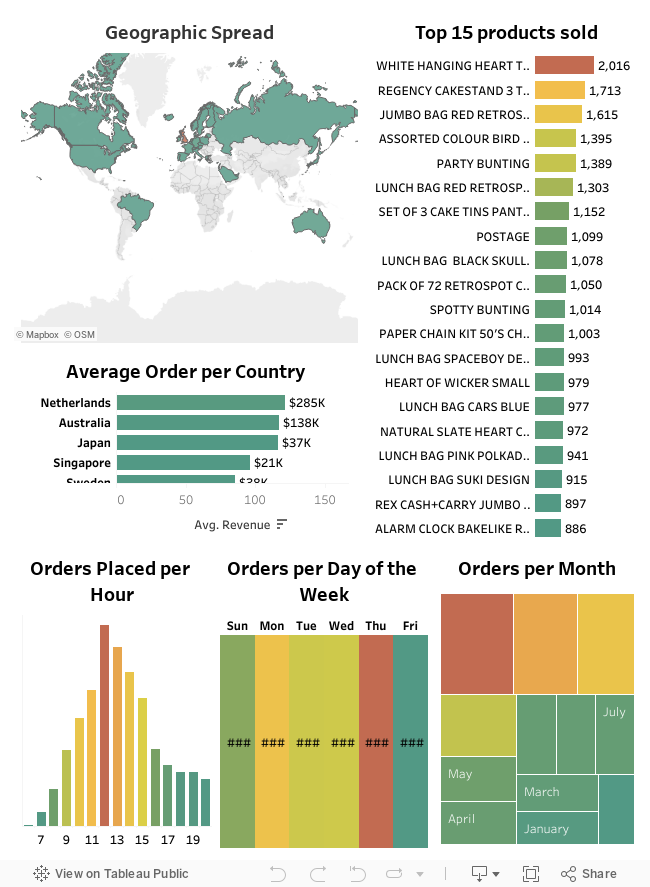
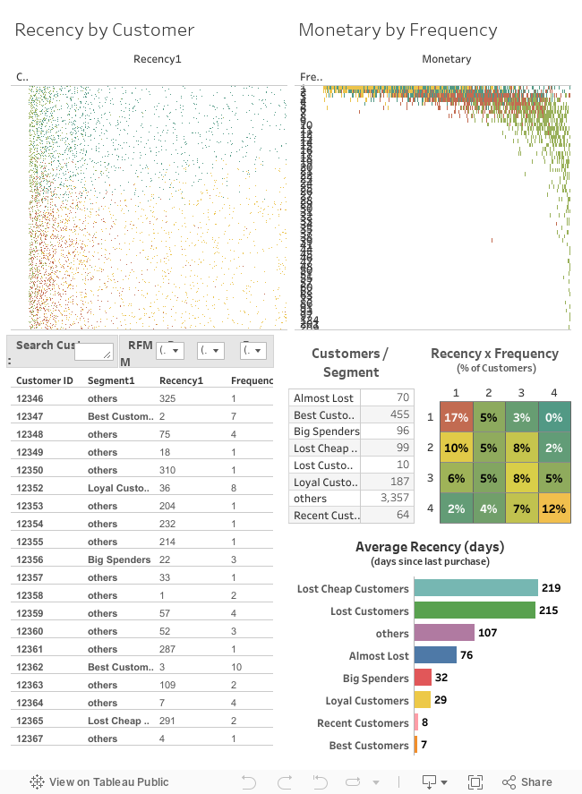
Create a dashboard in tableau by choosing appropriate chart types and metrics useful for the business. The dashboard must entail the following:
a) Country-wise analysis to demonstrate Average spend. Use a bar chart show monthly figures.
b) Bar graph of top 15 products which are mostly ordered by the users to show the number of products sold.
c) Bar graph to show the count of orders Vs. hours throughout the day. What are the peak hours per your chart?
d) Plot the distribution of RFM values using histogram and frequency-charts.
e) Plot error(cost) vs no of clusters selected
f) Visualize to compare the RFM values of the clusters using heatmap